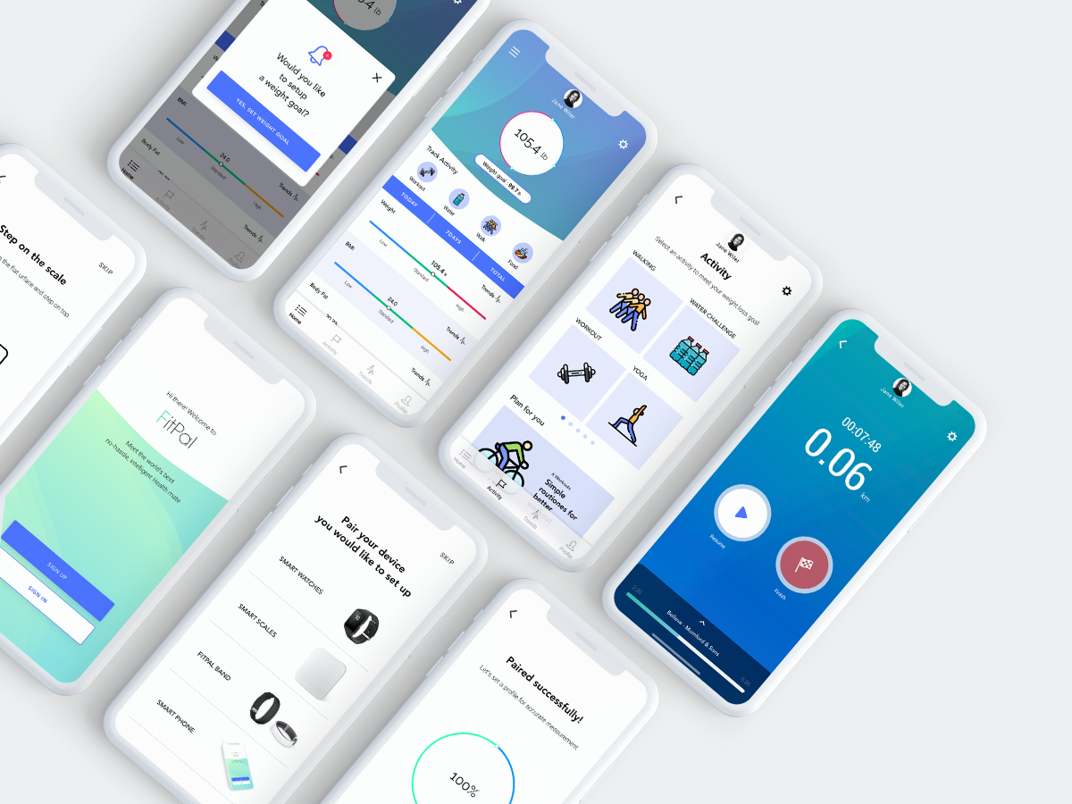
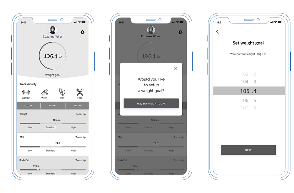
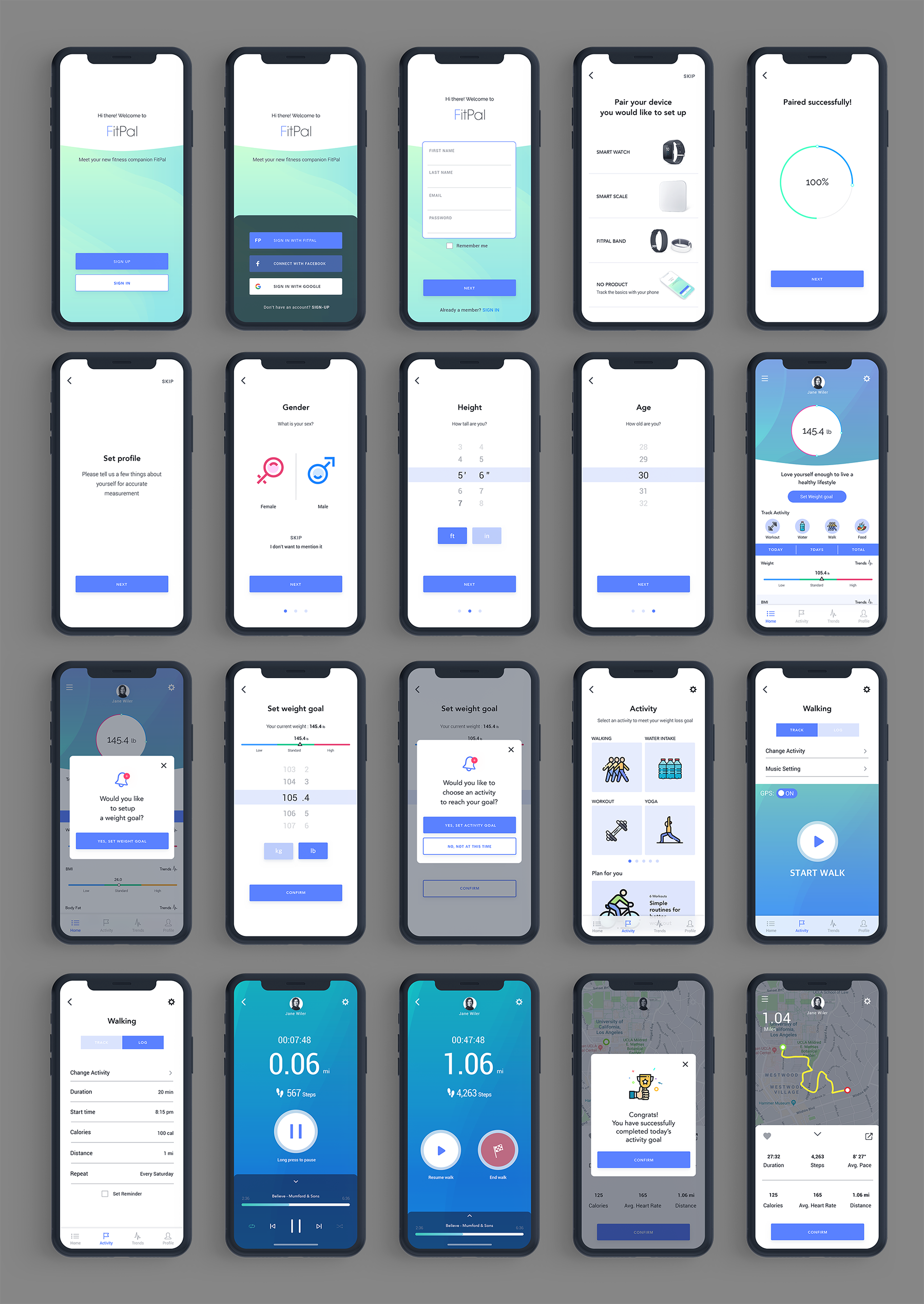
Use the FitPal the fitness app with wearable devices and get to know the smart scale which guide, rewards, and records all data automatically. And with tools such as trend screens and activity tracking - you can set goals and achieve them.
MY ROLESUser Research, User Flows, Wireframes & Prototypes, UI Style guide, User Testing,
High-Fidelity, Web Design & Developement
2 Weeks
TOOLS
Sketch
Invision
Adobe Photoshop
Adobe Illustrator
HTML/CSS
We believe that our users have difficulty in accurately tracking their activity and setting weight loss goals. We believe that FitPal may solve this problem by using real-time data from a smart scale to inform the user of important health insights and body metrics. To measure the success of our app we would like a 12% increase in user engagement by tracking new and returning users.
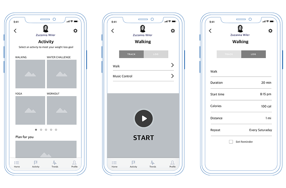
According to this survey, 95.7% of the 23 survey respondents were using the Fitness / Activity Tracking app. And those people who used the app were interested in being more active and losing weight by using step counts and viewing calories burned features. From this result, we created an activity section, which is one of the key features of our app. Users can use the Fitpal scale to go directly to the activity section with more accurate body composition using the all-in-one app.
52.2% of people used the fitness app for a more active life, and 39.1% used apps for weight loss. The remaining users used it for tracking sleep activity. As a result, we added all those features as well as activities for the user since we believe it can improve their lifestyle as a whole by using our app
More than 80% of the survey responders used the app as a step counter and checking calories burnt, so we found out the user is interested in checking their activities on the app.
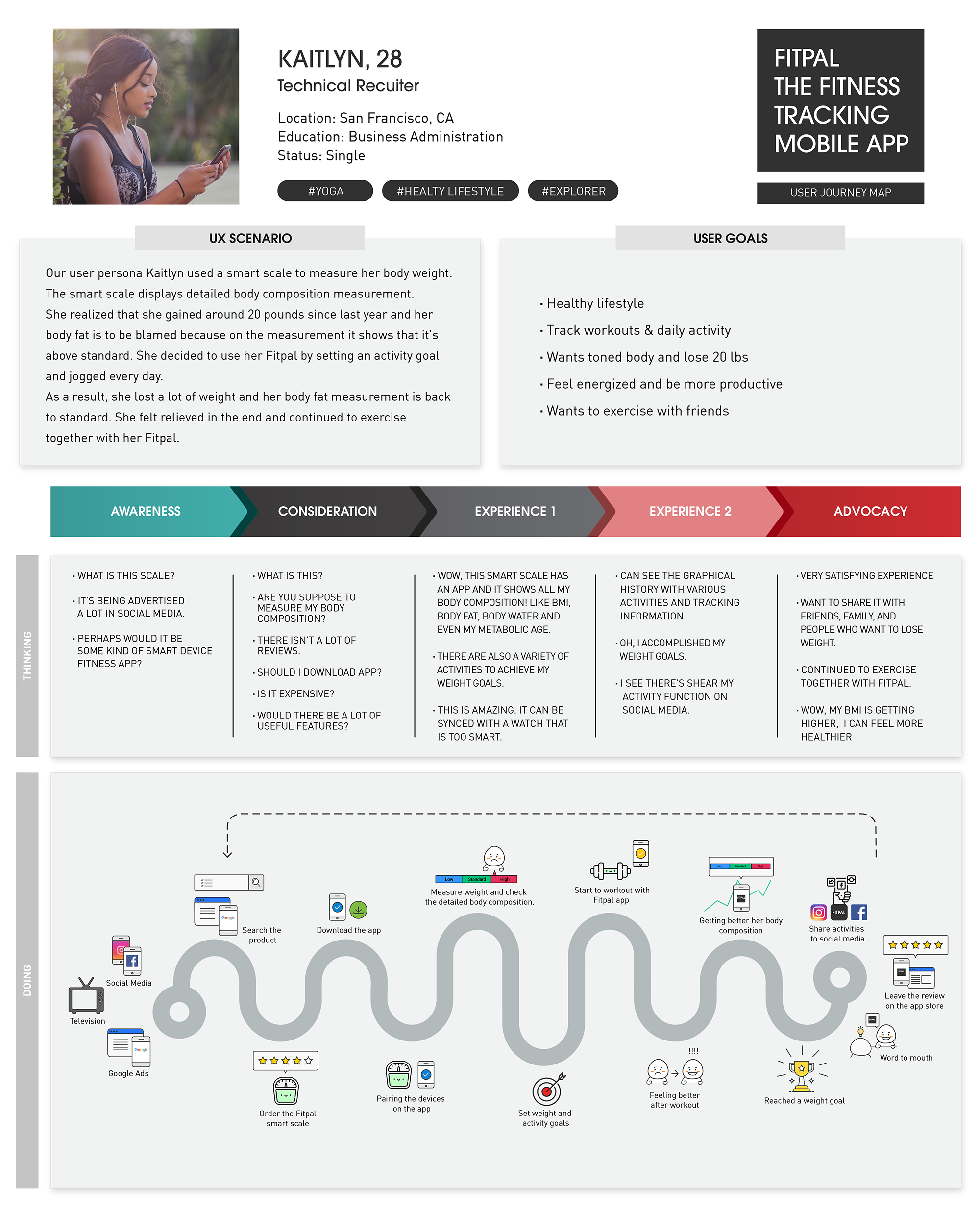
User persona and journey map was used to understand the user deeply. Using the user’s persona as the thesis of a story. With the story, we would further understand the user as if it was us and more accessible to solve the problems that the user was facing by adding specific features to the app.
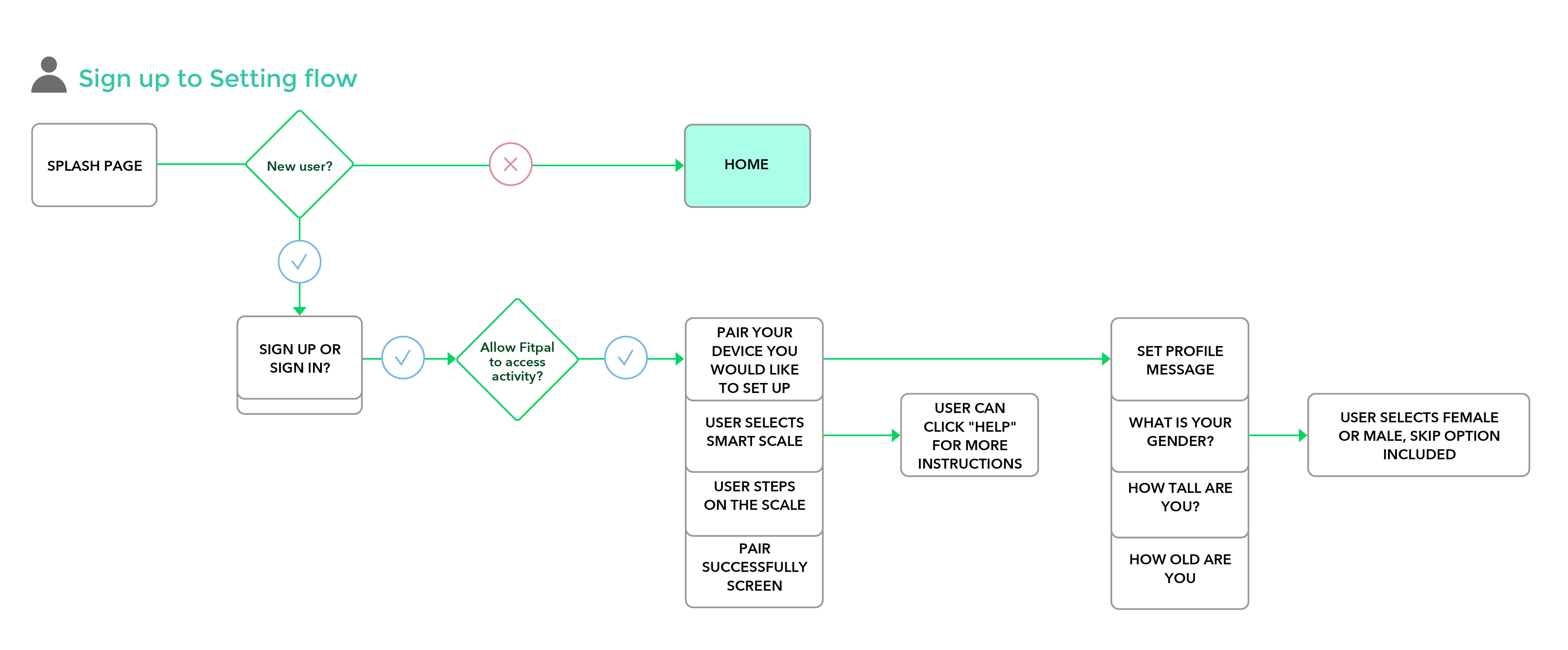
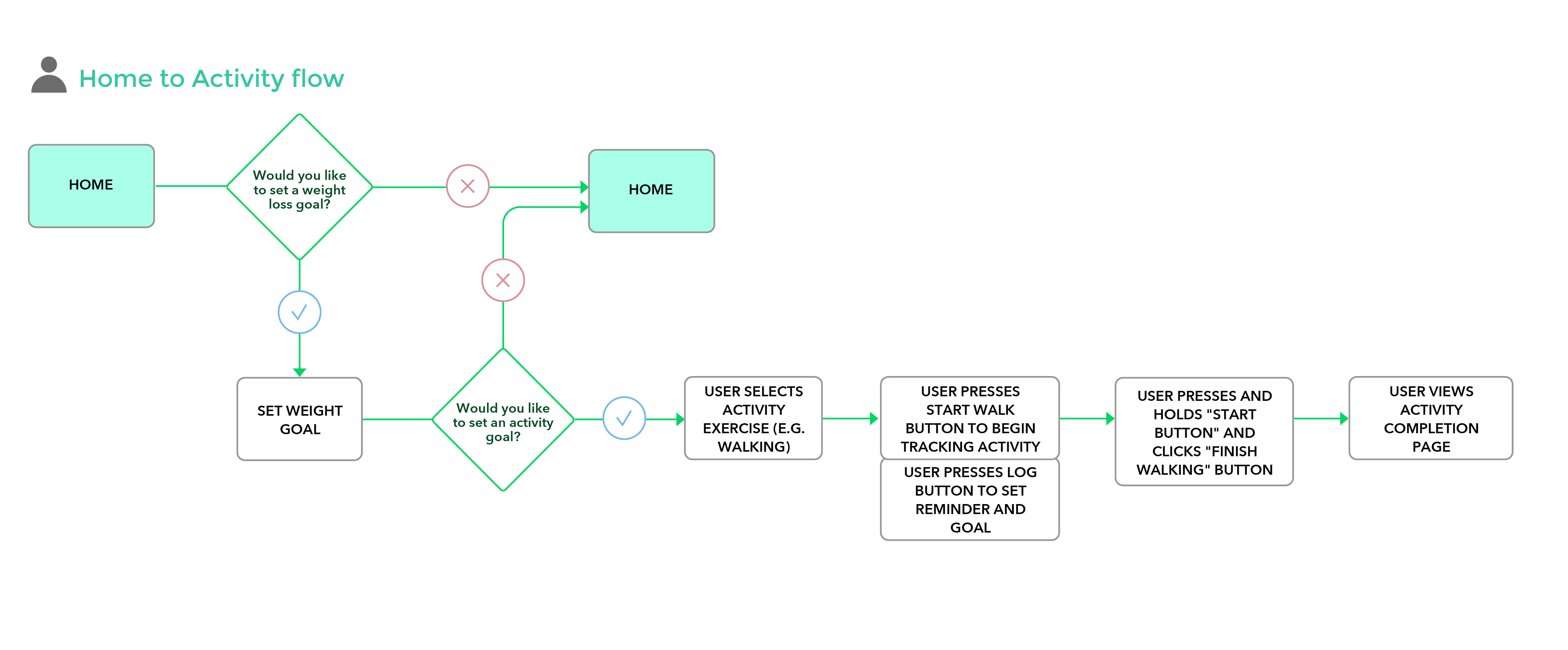
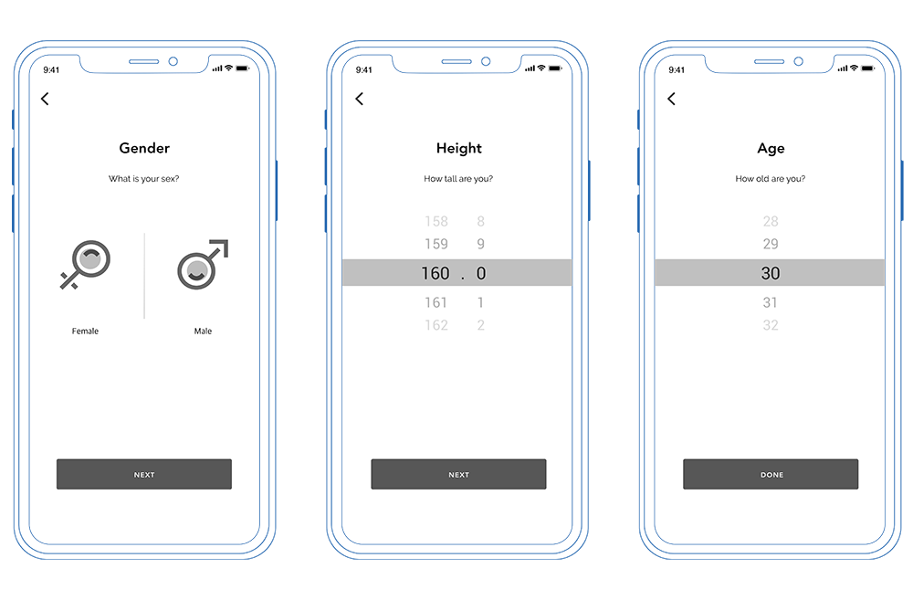
From my user research, I created user flows from “sign up” to “play meditation” which is more user friendly and also set a reminder to make it easier to access features.
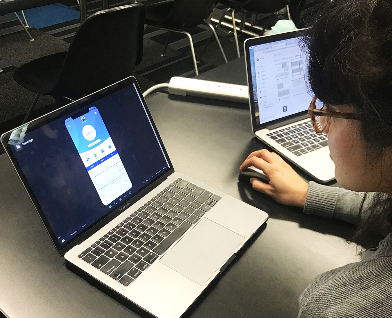
These are the initial wireframes. Edited and removed unnecessary items after user-testing 6 different people based on comfortability and usability.
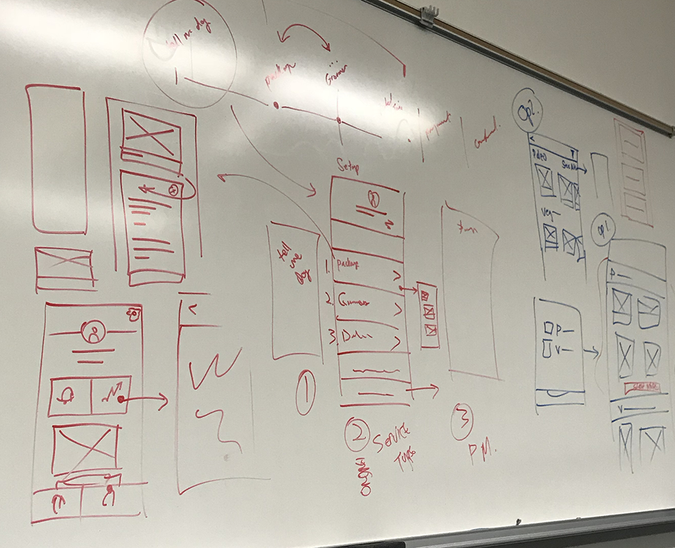
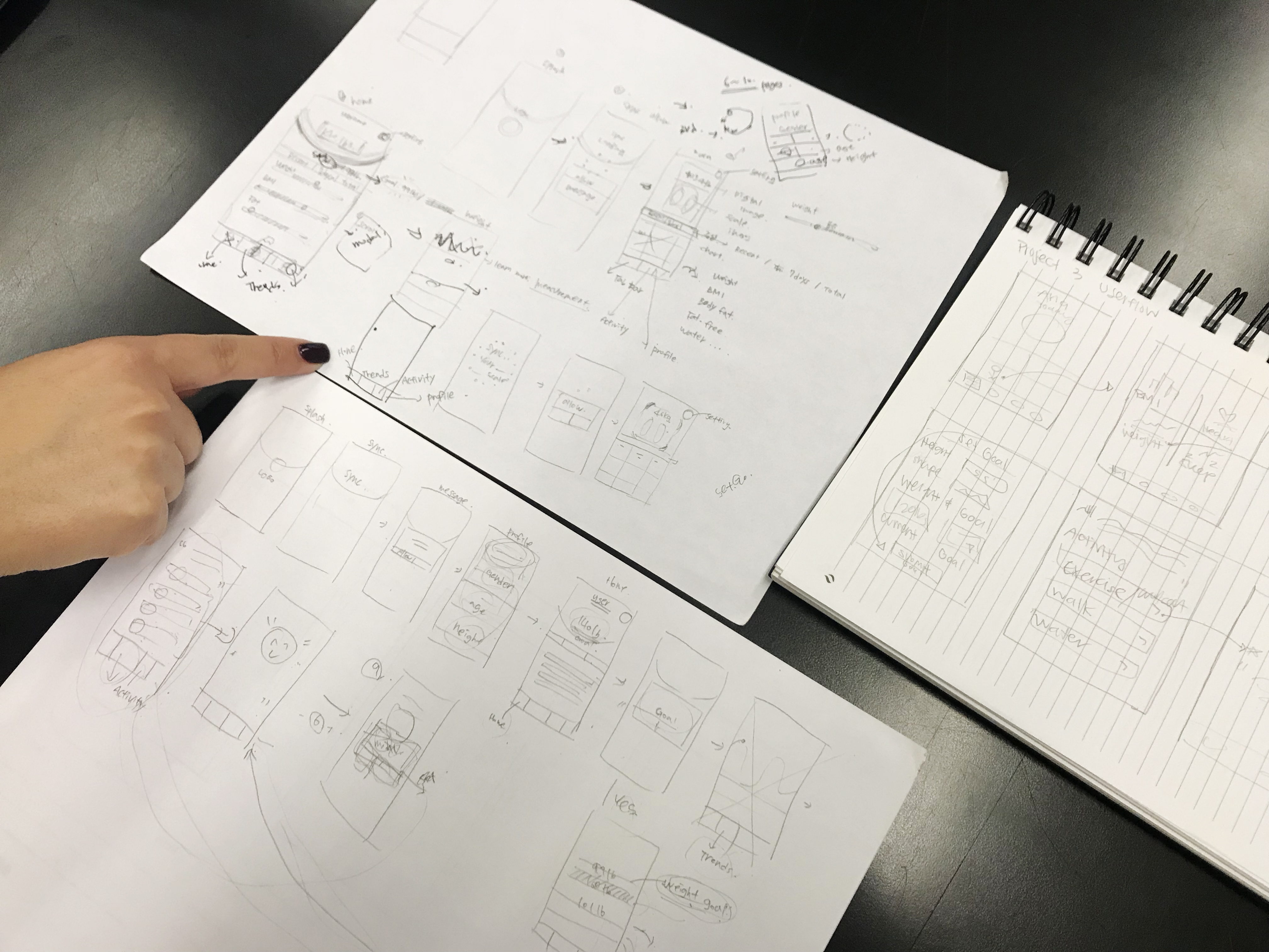 Idea Sketch
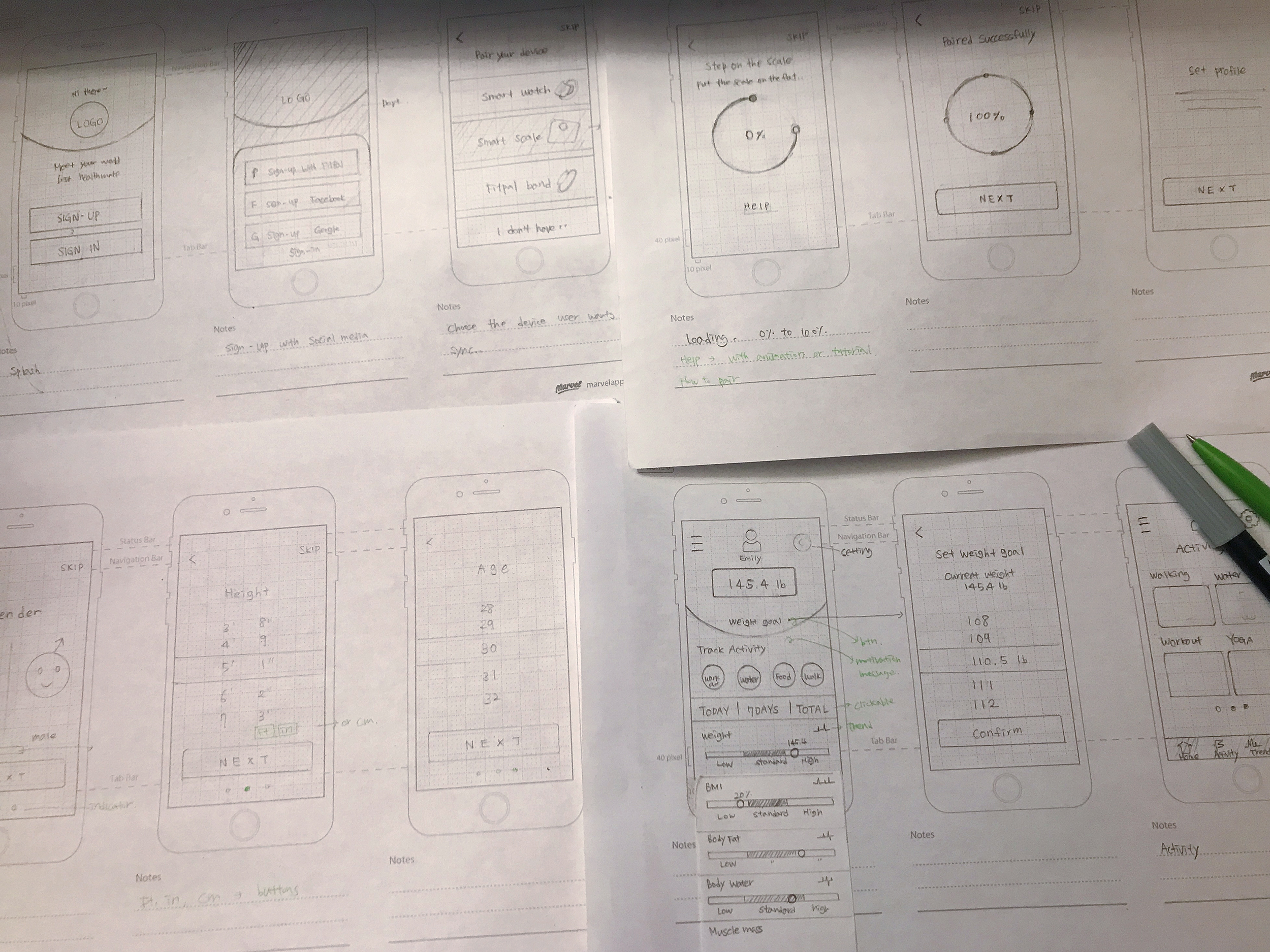 Iterate of paper prototype
Iterate, iterate, iterate
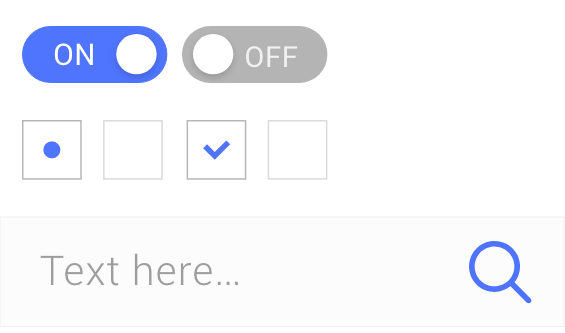
Roboto Regular
Far far away, behind the word mountains, far from the countries Vokalia and Consonantia, there live the blind texts.
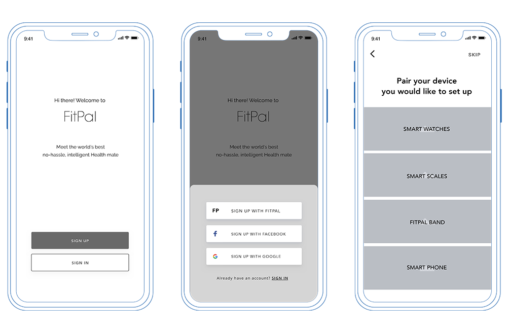
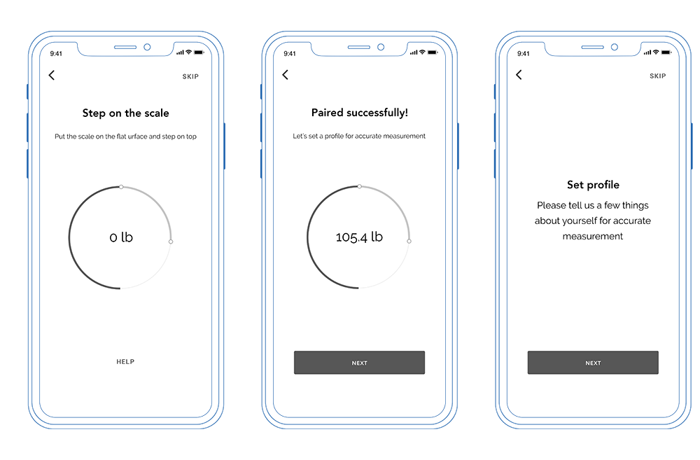
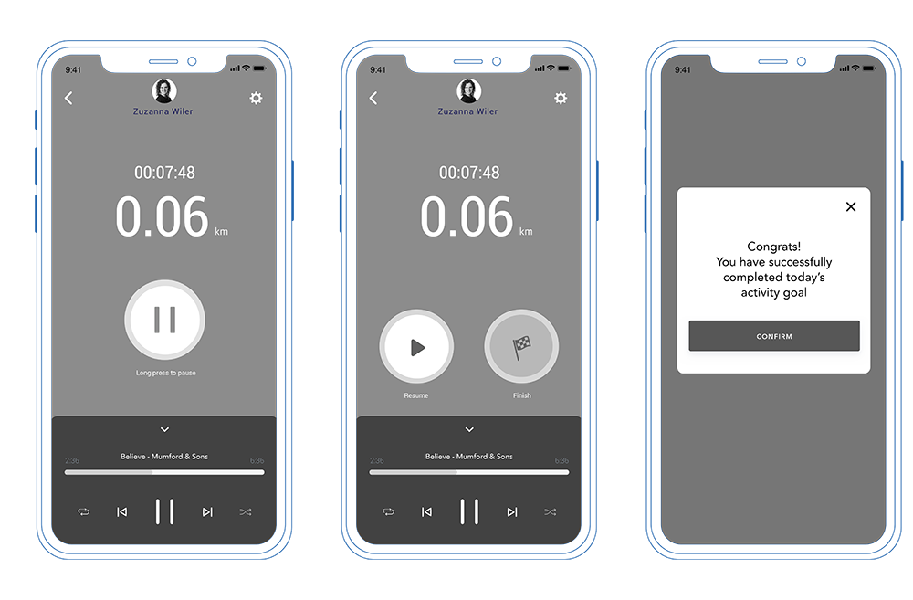
The completed screens below show effects of several feedbacks and adjustments that were made.
Smartwatch
What I learned
This project was exciting and fun by creating a new technology with a wearable device. And I learned a lot by exploring in-depth UX process from iterations of failure and success.
Failing fast is the answerWe made wireframes as fast as possible after the UX process stage. Problems that were not seen in the user flow were visible after wireframes were created, and through several testing and numerous advice, we were able to quickly and efficiently iterate the design.