Conclusion
What I experienced
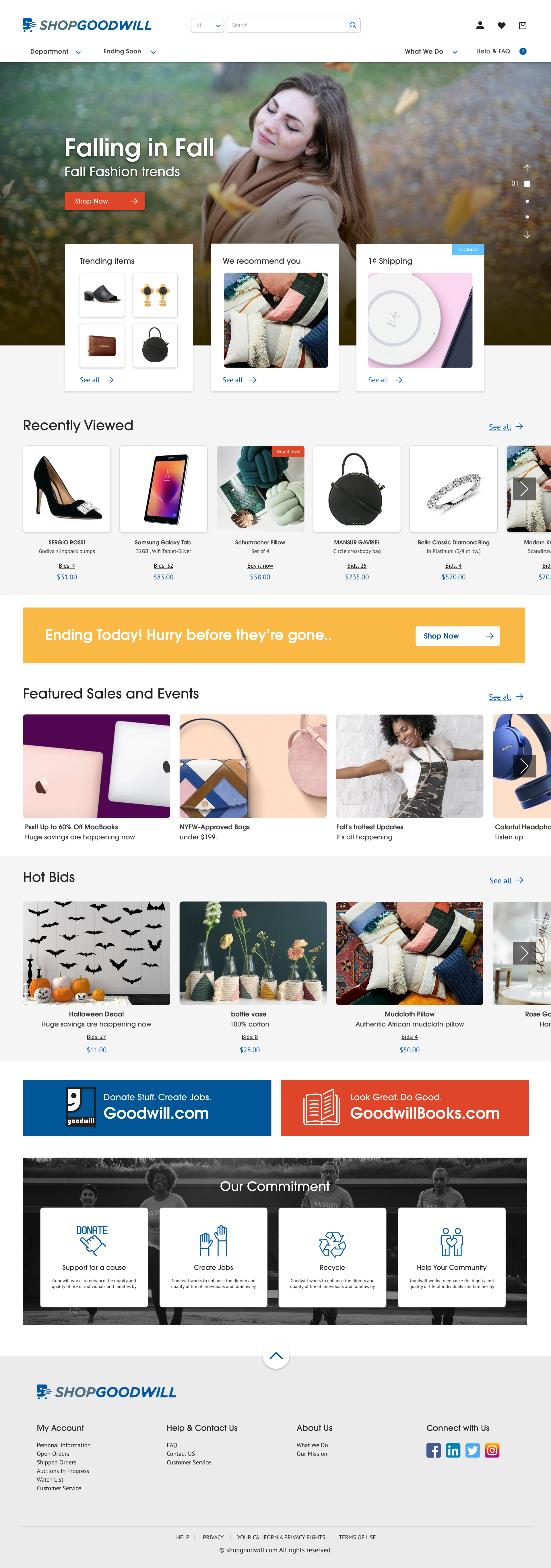
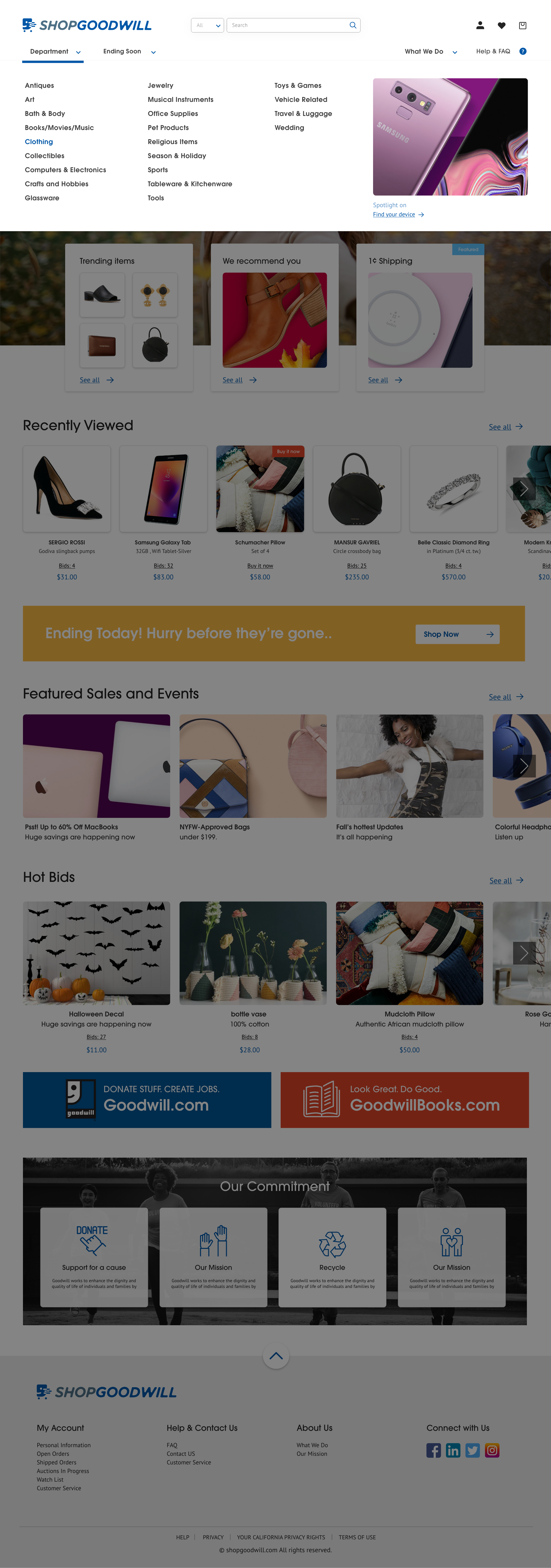
Beginning with non-profit website redesign, we chose Goodwill among many other NPOs. The reason is that Goodwill is much more accessible and close to us than other institutions. But we have seen many things that needs improvement when analyzing a website.
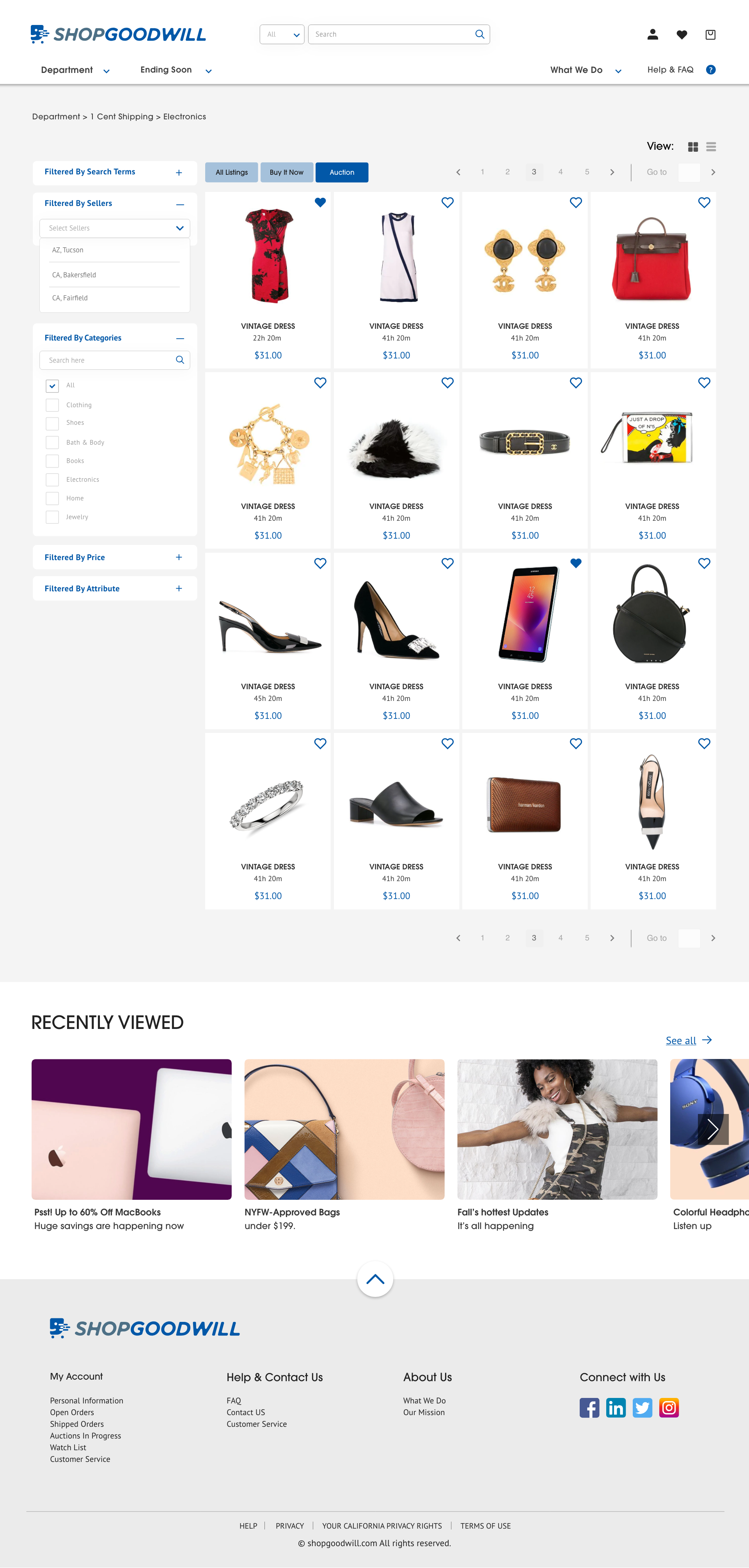
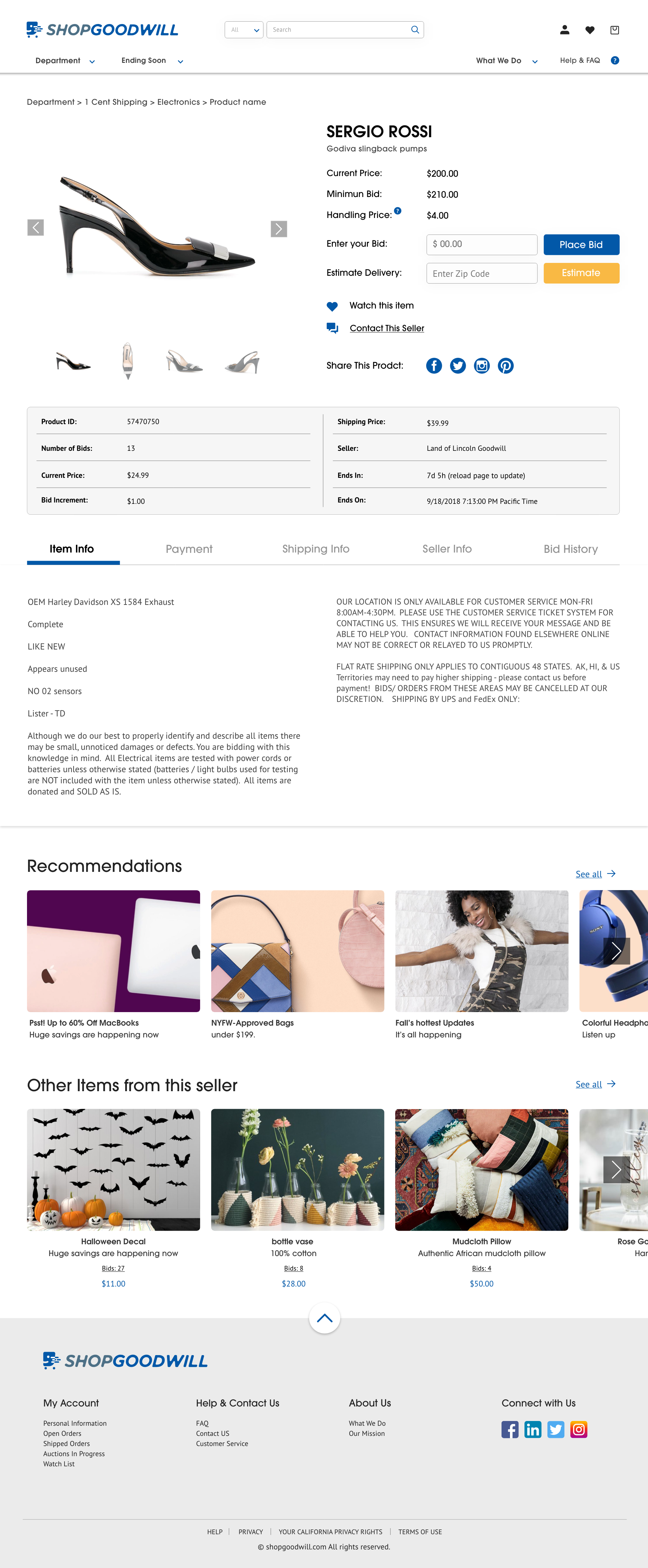
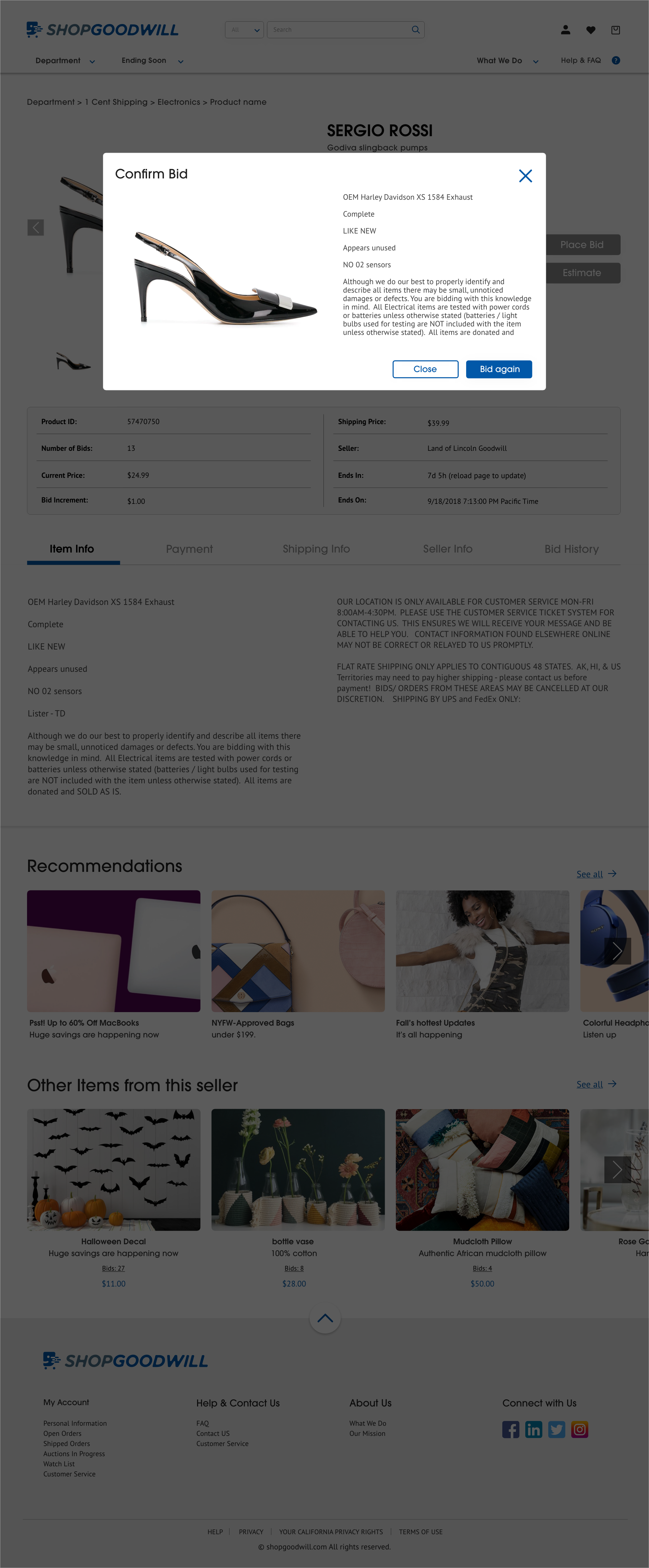
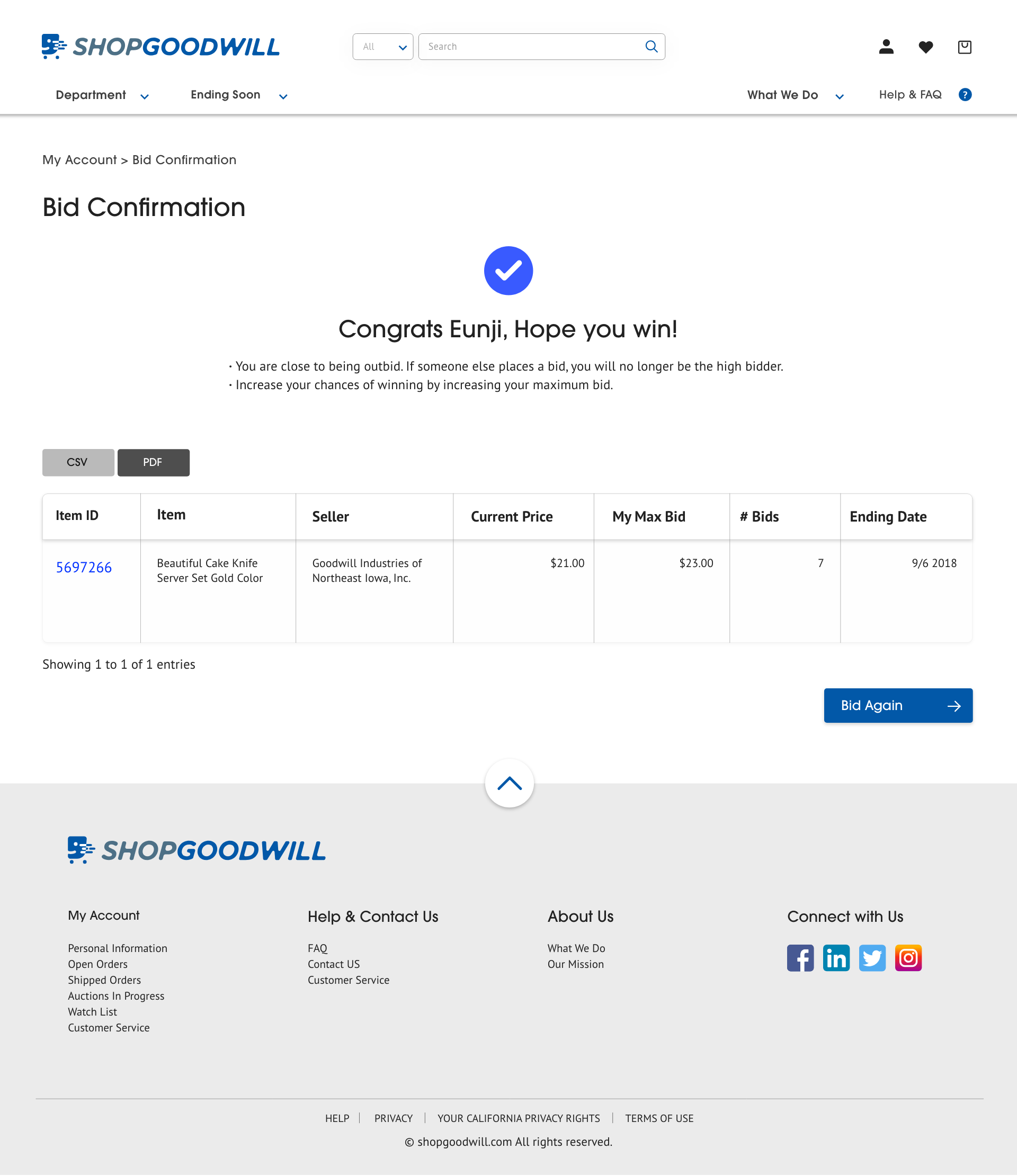
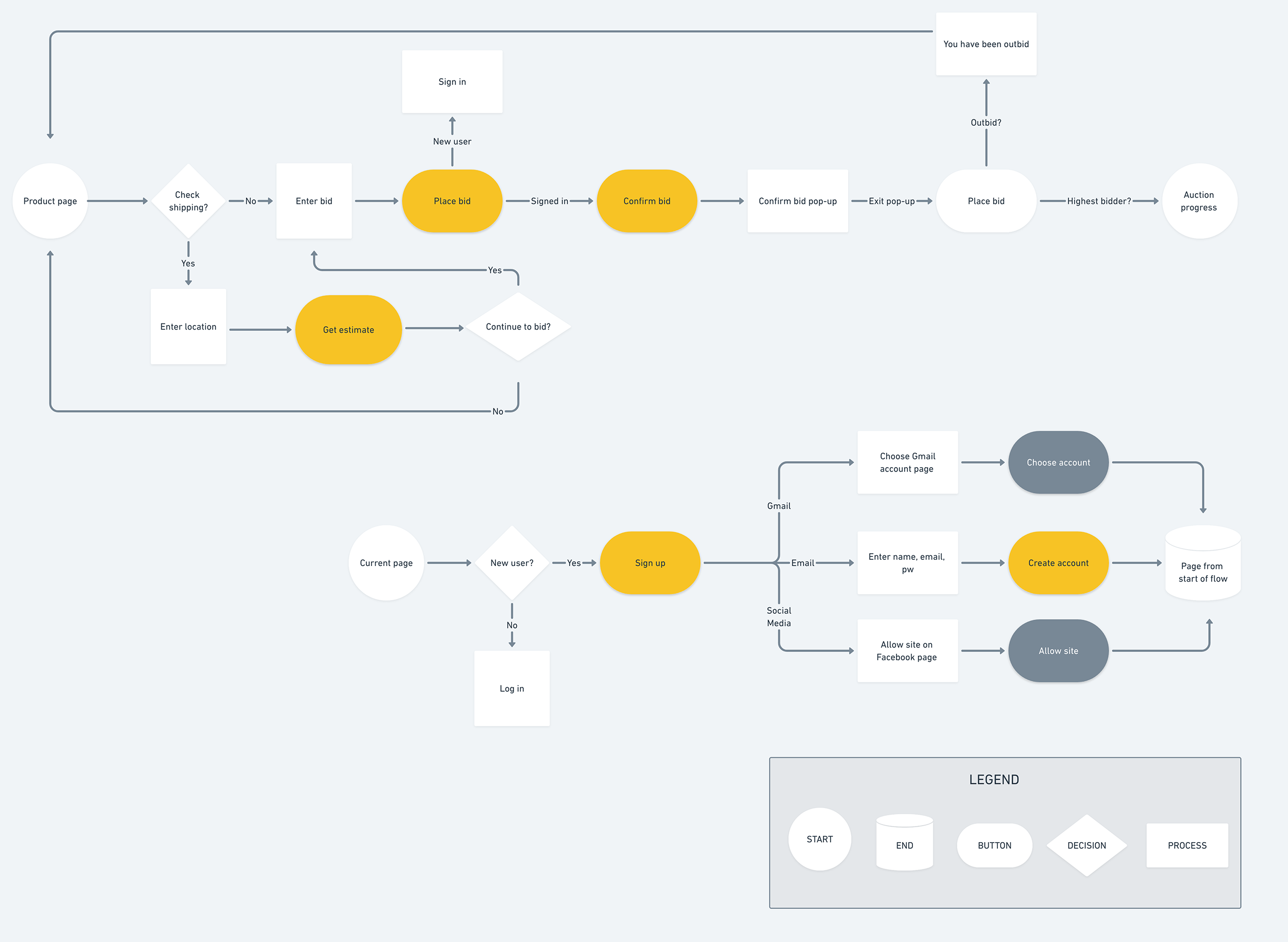
The problem consisted with 1.5-star reviews and 90-year style auction website. We wanted to turn this institution into a modern website and redirected the most important bid flow. We have reduced the number of steps, modified the bead confirmation and rebid to access it in a short time. It was a very enjoyable experience, but we could not send the result because we could not reach them. I hope shop goodwill to be a website that many people can use with a good design.
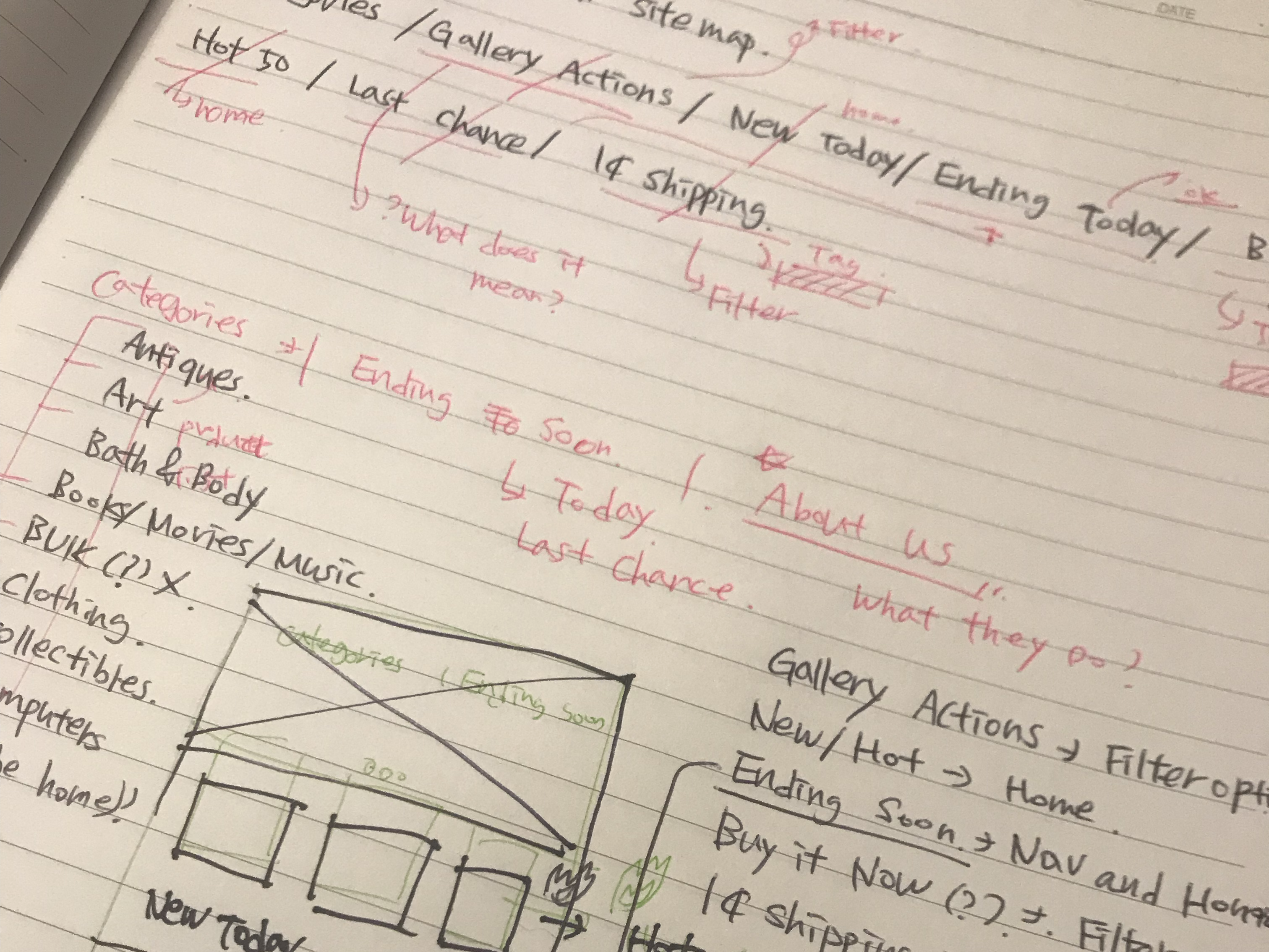 Brainstorming note
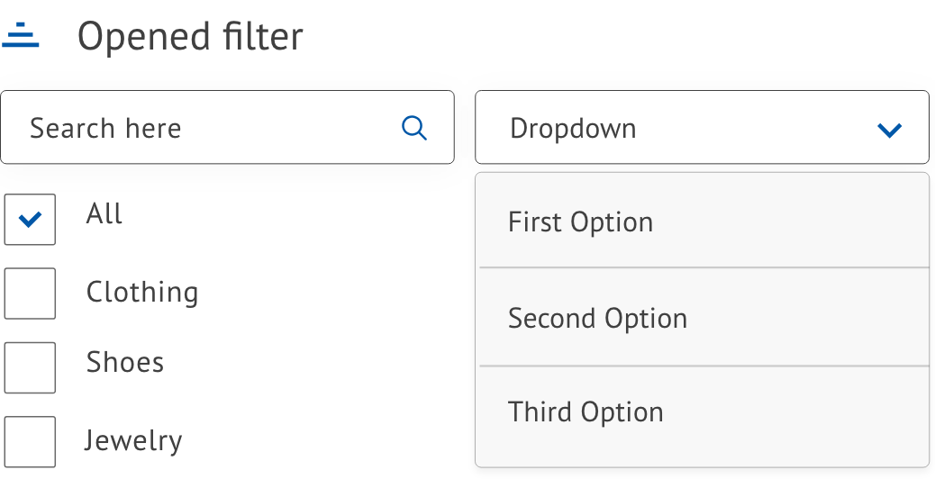
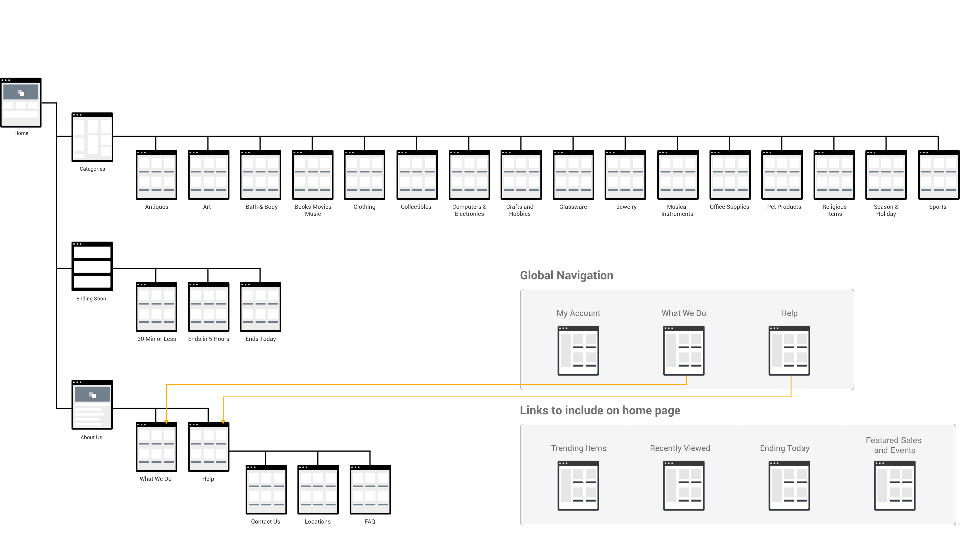
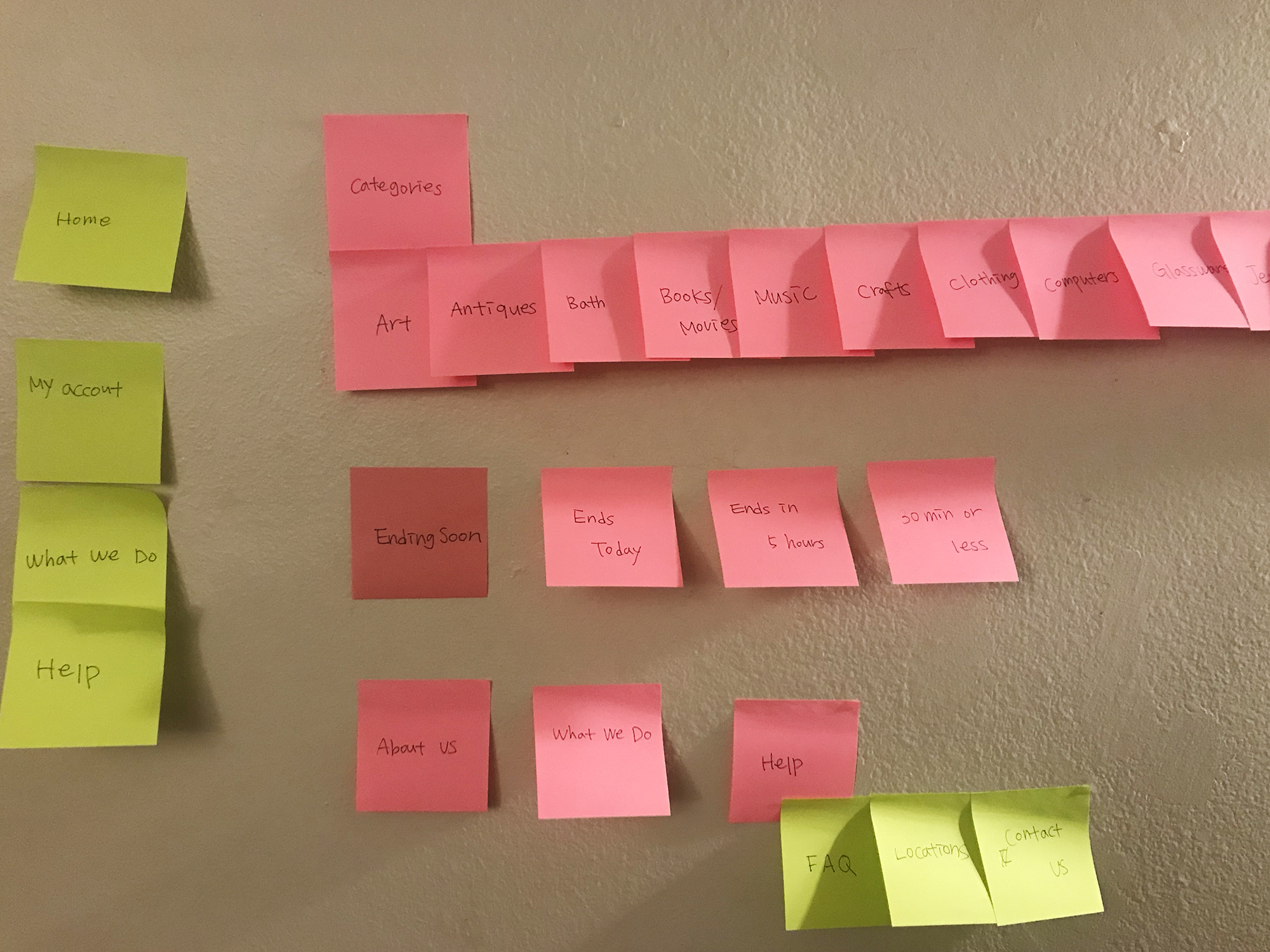 Categories
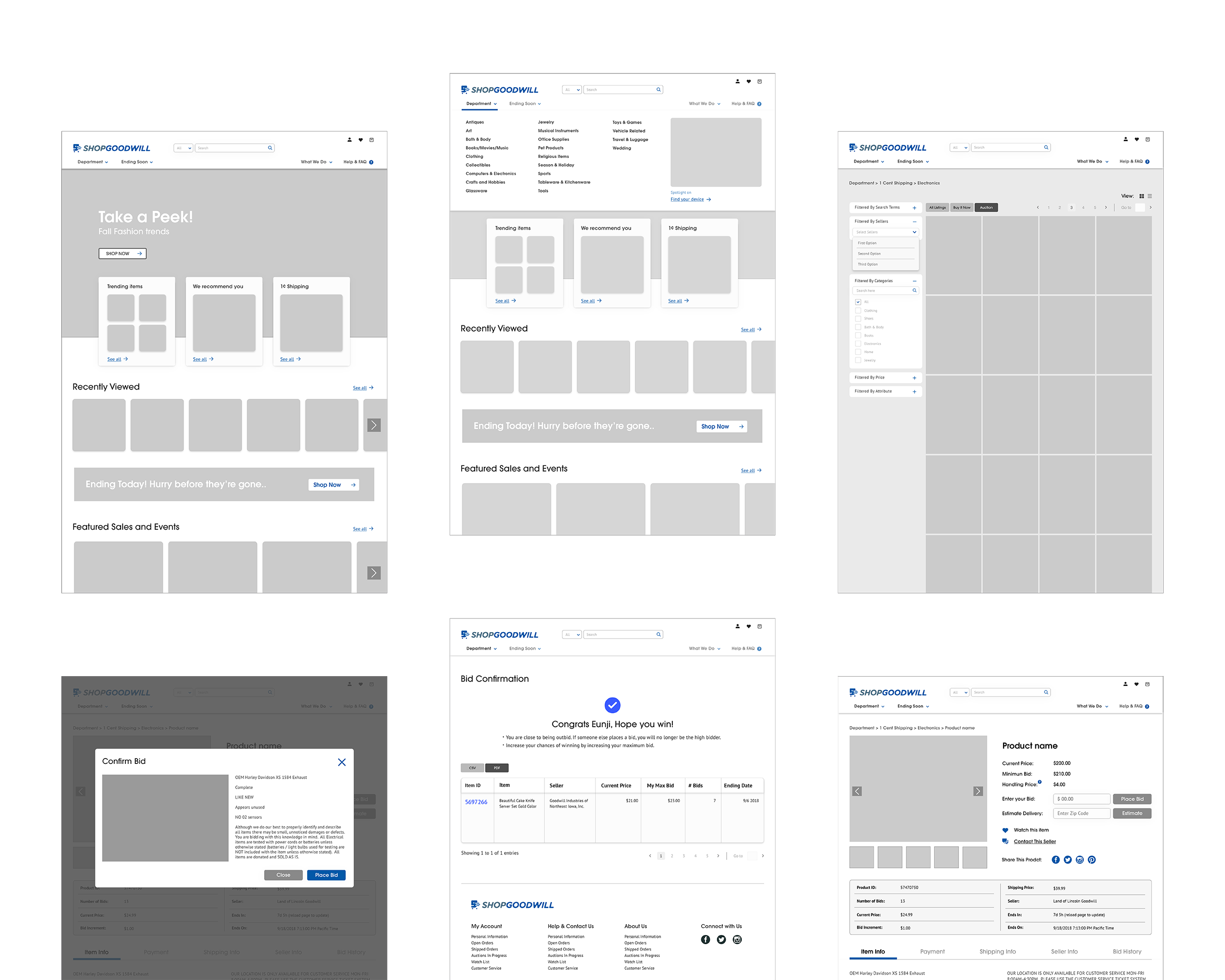
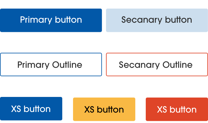
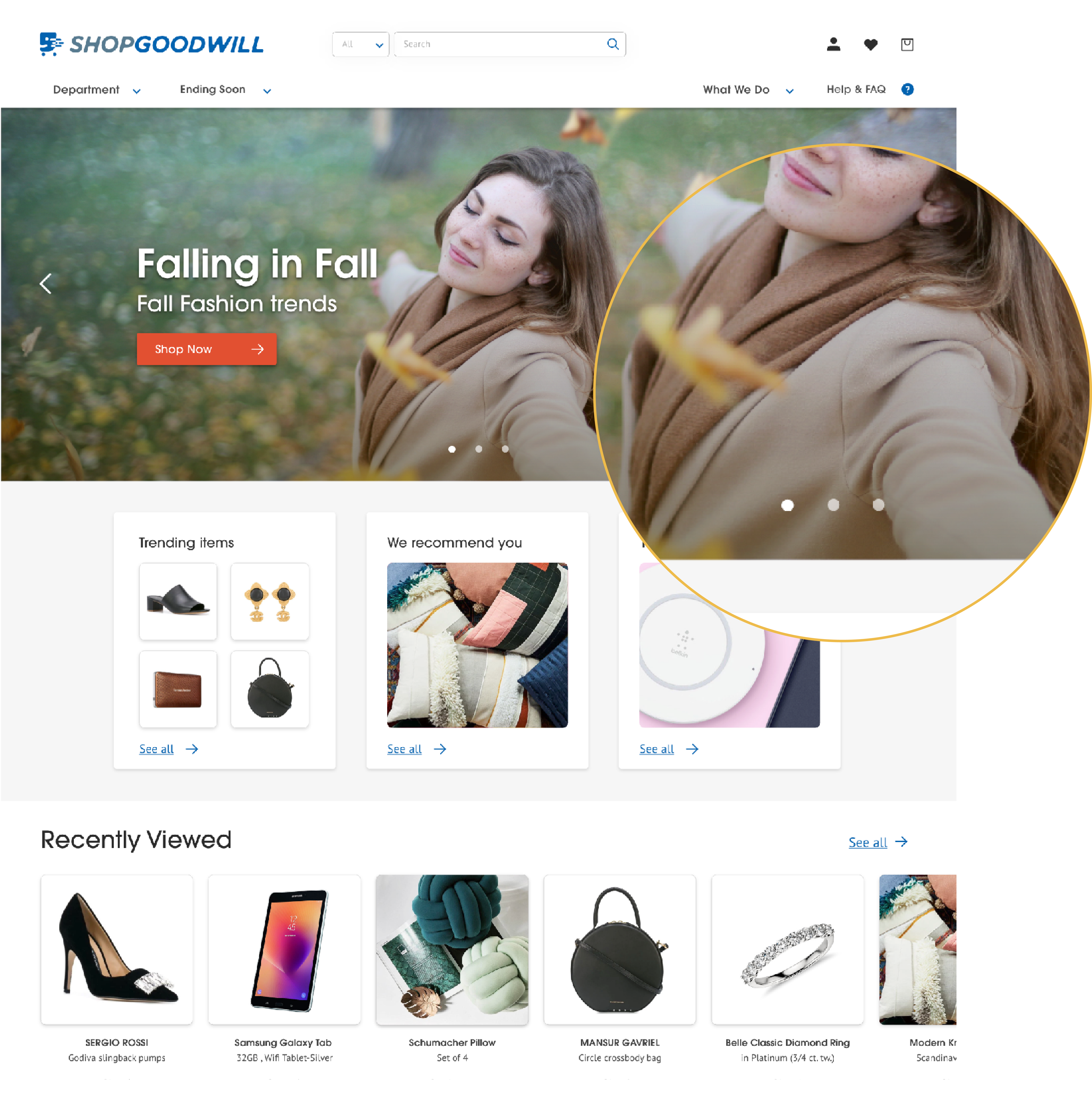 A Ver.
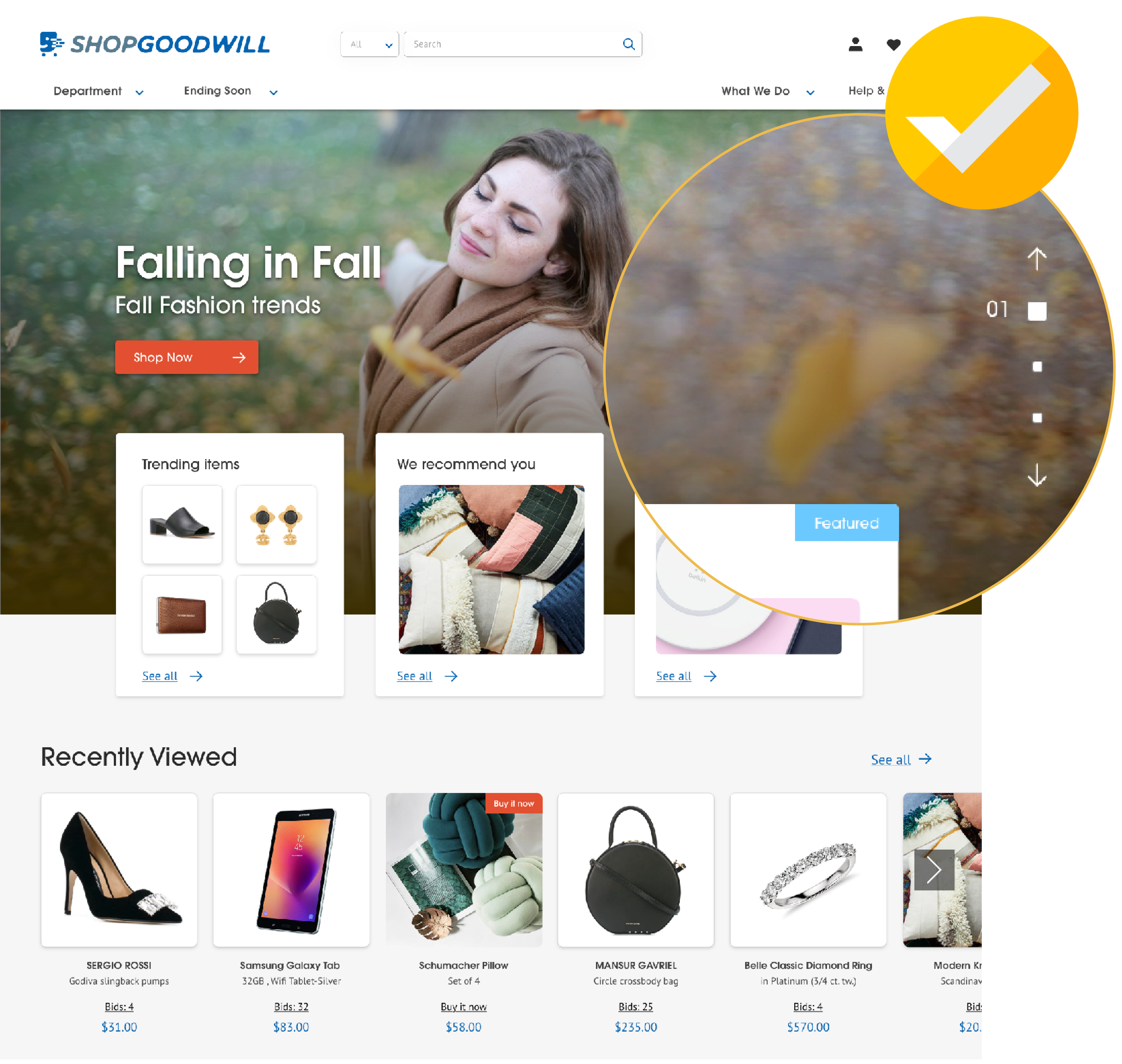 B Ver.